🧭 Introduction
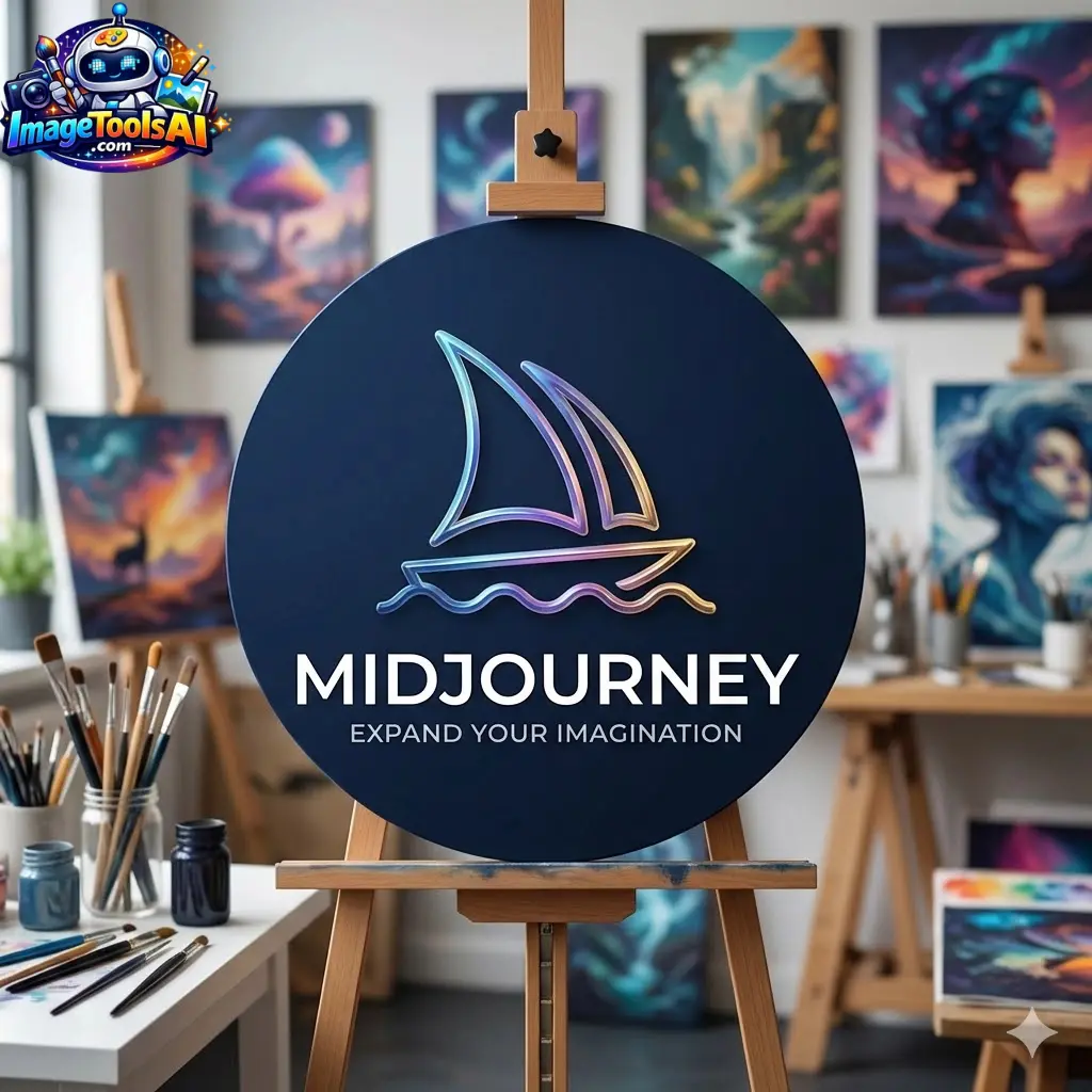
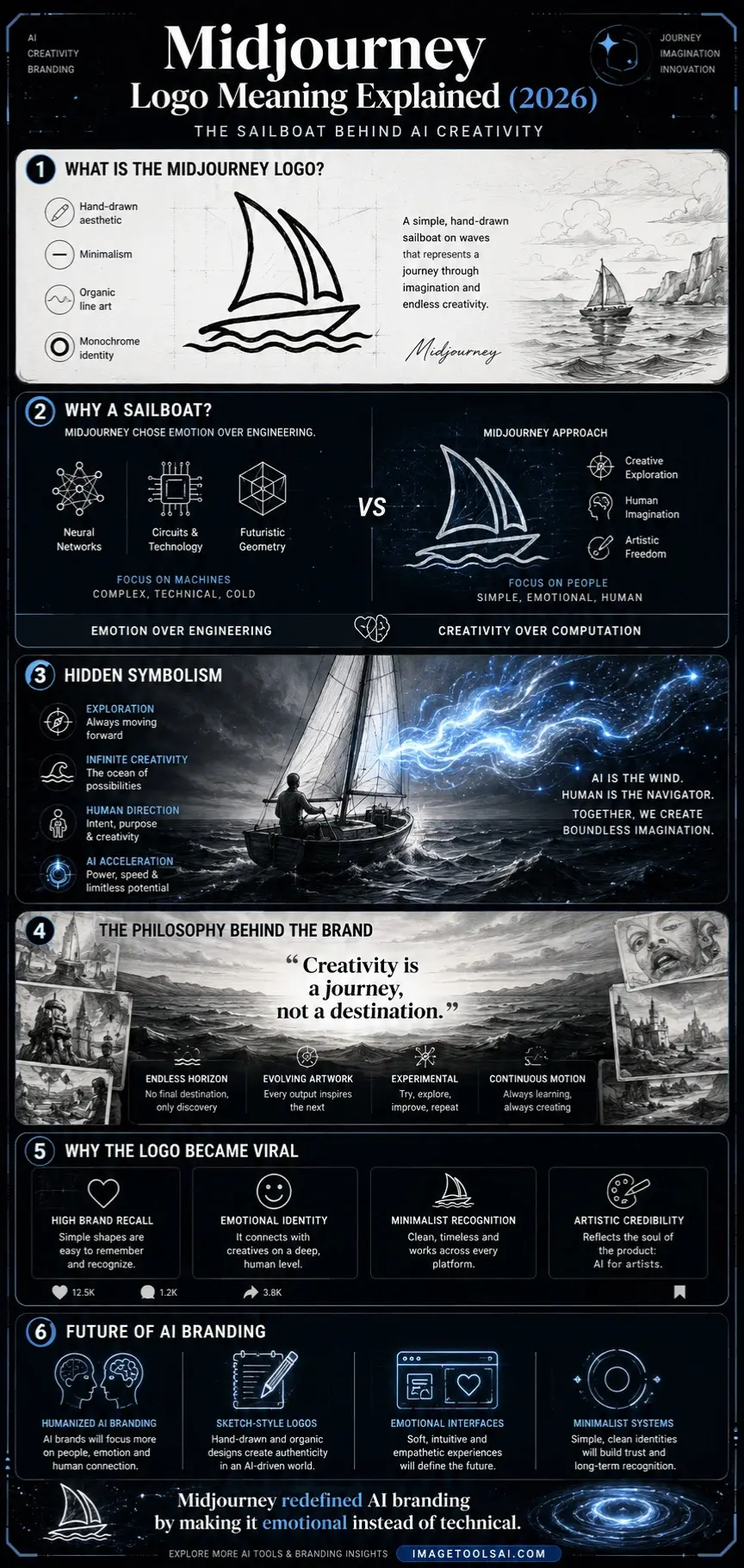
The Midjourney logo is one of the most recognizable symbols in modern AI branding. At first glance, it looks simple—a small, hand-drawn sailboat floating on waves. But behind this minimal sketch lies a deep philosophy about creativity, exploration, and the future of artificial intelligence.
Unlike traditional tech companies that rely on futuristic neon symbols or abstract circuit patterns, Midjourney chose something unexpected: a sailboat. This decision is not random. It reflects how the platform understands creativity—not as a machine-driven output, but as a journey guided by imagination.
In this guide, we will break down the Midjourney logo meaning, its design principles, branding strategy, and why it has become a powerful identity in the AI world. Whether you are a designer, marketer, or AI enthusiast, this deep dive will help you understand why this simple logo carries so much meaning.
What Is the Midjourney Logo?
The Midjourney logo is a minimalist, monochrome illustration of a sailboat on waves, typically drawn in a sketch-like style.
Key Characteristics:
- Black and white color scheme
- Hand-drawn aesthetic
- Simple line art
- No gradients or modern effects
- Organic, imperfect strokes
Unlike corporate logos, it feels more like a concept sketch from an artist’s notebook rather than a polished tech identity.
⛵ Meaning Behind the Midjourney Logo
The Concept of “Journey.”
The name Midjourney itself suggests being in the middle of a creative process.
- Not starting
- Not finishing
- But constantly evolving
The sailboat represents this ongoing movement—always traveling, never static.
The Ocean = Infinite Creativity
In branding psychology, water often symbolizes:
- Infinite possibilities
- Emotional depth
- Exploration without boundaries
Midjourney uses the ocean as a metaphor for AI creativity:
There is no fixed destination in imagination.
Human Direction + AI Power
The sailboat metaphor is powerful because:
- Human = navigator (intent, creativity)
- AI = wind (power, acceleration)
Together, they create motion—this is exactly how Midjourney works.
Imperfection as a Feature
Unlike polished tech logos, the sketch style communicates:
- Creativity over precision
- Emotion over structure
- Art over engineering
This aligns perfectly with AI-generated art workflows.
Why a Sailboat Instead of a Tech Symbol?
Most AI companies use:
- Neural networks
- Digital grids
- Circuit patterns
- Futuristic abstract shapes
But Midjourney intentionally avoids that.
Strategic Reason:
It positions the brand as:
✔ Artistic tool, not engineering tool
✔ Creative platform, not technical system
✔ Emotional experience, not software utility
This is a major branding advantage in 2026’s AI market.
Design Breakdown of the Midjourney Logo
Minimalism
- No complex geometry
- No color distractions
- Pure visual clarity
Minimalism improves:
- Memory retention
- Brand recognition
- Emotional Impact
Sketch Aesthetic
It looks intentionally unfinished.
This creates:
- Authenticity
- Human touch
- Artistic identity
Emotional Symbolism
Instead of showing AI, it shows:
- Movement
- Exploration
- Imagination
Memorability Factor
Simple shapes are easier to recall:
- High recognition rate
- Strong brand recall
- Viral design identity
Midjourney Brand Identity Philosophy
🔹 “Creativity is a Journey, Not a Destination.”
This is the core philosophy behind the logo.
It reflects:
- Continuous experimentation
- Infinite creative evolution
- No final version of art
That is why the logo has remained unchanged since launch.
Midjourney Logo vs Traditional AI Branding
| Traditional AI Logos | Midjourney Logo Approach |
| Futuristic neon | Hand-drawn sketch |
| Geometric patterns | Organic illustration |
| Complex visuals | Minimal simplicity |
| Machine symbolism | Human creativity focus |
Midjourney Logo PNG & Transparent Usage
People often search:
- Midjourney logo PNG
- Midjourney transparent logo
Common Uses:
- Blog illustrations
- AI comparison articles
- Educational content
- Design references
Note: The logo belongs to Midjourney and is protected intellectual property.
Why the Midjourney Logo Became Viral
The logo gained massive popularity because:
- It breaks tech branding norms
- It looks like AI-generated art itself
- It feels emotional, not corporate
- It matches the output of the platform
This creates strong brand-product alignment, which is rare in AI tools.
Benefits of This Branding Approach
- Strong emotional identity
- High user recall
- Differentiation in the crowded AI space
- Appeals to creatives, not engineers
- Builds artistic credibility
Future of AI Logo Design Trends
The Midjourney logo influenced a broader shift:
Emerging Trends:
- Sketch-style branding
- Humanized AI visuals
- Emotional design systems
- Minimalist identity layers
Companies like OpenAI and others are also moving toward softer branding styles.
Who Should Study This Logo?
✔ UI/UX designers
✔ Branding professionals
✔ AI founders
✔ Digital marketers
✔ Creative agencies
❓ People Also Ask
A: It represents exploration, creativity, and continuous movement in AI-generated art.
A: It symbolizes a journey through imagination where humans guide creativity and AI powers execution.
A: Yes, it is owned by Midjourney and protected under branding and intellectual property laws.
A: Only for educational or reference purposes unless you have official permission.
A: To reflect artistic creativity rather than machine precision or corporate structure.
Social Media Captions
- “Why does Midjourney use a sailboat? The answer will change how you see AI branding.”
- “This simple sketch is one of the most powerful AI logos ever created.”
- “Midjourney didn’t design a logo—it designed a philosophy.”
Pinterest Title
Midjourney Logo Meaning Explained: The Sailboat Behind AI Creativity
YouTube Title
Midjourney Logo Explained: Hidden Meaning, Design & Branding Strategy (2026)
Conclusion
The Midjourney logo is more than a visual identity—it is a complete branding philosophy. By choosing a simple sailboat instead of a technical symbol, Midjourney redefined how AI companies express creativity.
It represents:
- Exploration Over Limitation
- Creativity over computation
- Journey over destination
This makes it one of the most influential AI brand identities in the modern digital era.
If you are building content around AI tools, branding, or design systems, this case study is essential for understanding the future of visual identity.
Explore more AI tools and branding insights on ImageToolsAI.com to stay ahead in the evolving AI ecosystem.